ARCHWORX LABS
ArchworX Labs — Brand & Logo
ArchworX Labs is a revenue-infrastructure consultancy — it architects "Revenue Operating Systems" (CRM, AI, automation, and revenue operations) that help clinics and real-estate businesses capture, convert, and scale revenue predictably.
The identity centers on the "X" in ArchworX — a structural cross where pipelines and systems intersect — rendered in a deep oxblood with a machined, beveled depth. It reads serious, premium, and engineered, paired with a confident geometric wordmark over a fine rule.
We delivered a full system — primary lockup, white-reversed lockup, and the standalone X monogram/favicon — on an oxblood, wine, ink, and stone palette with Archivo as the typeface, plus a multi-page brand guidelines document.
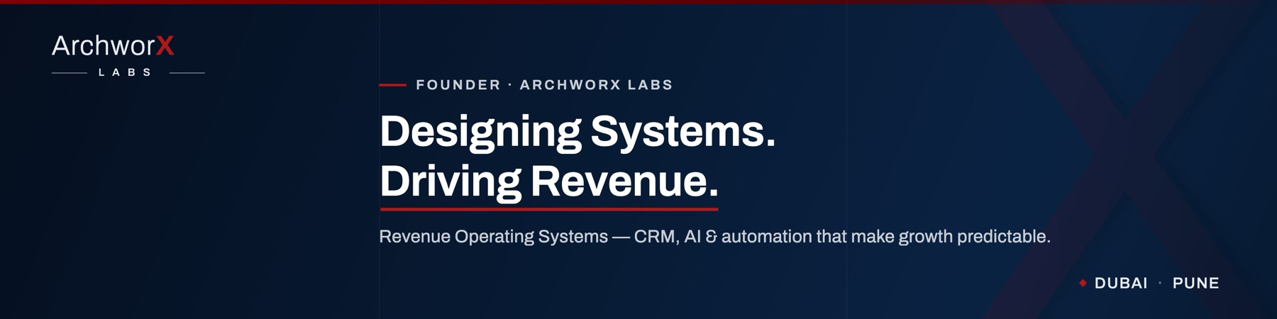
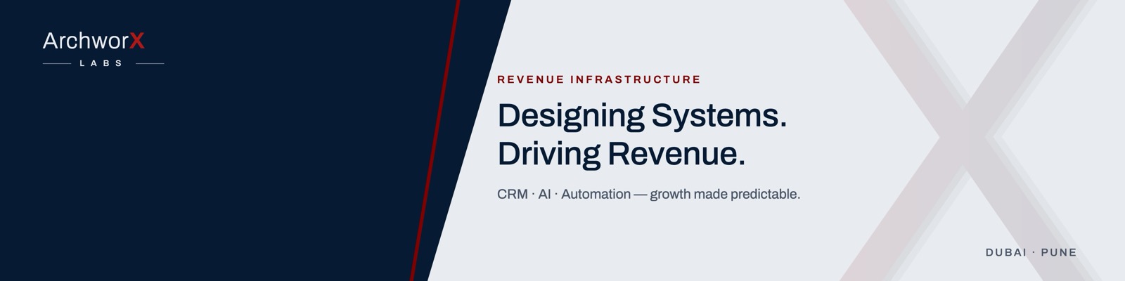
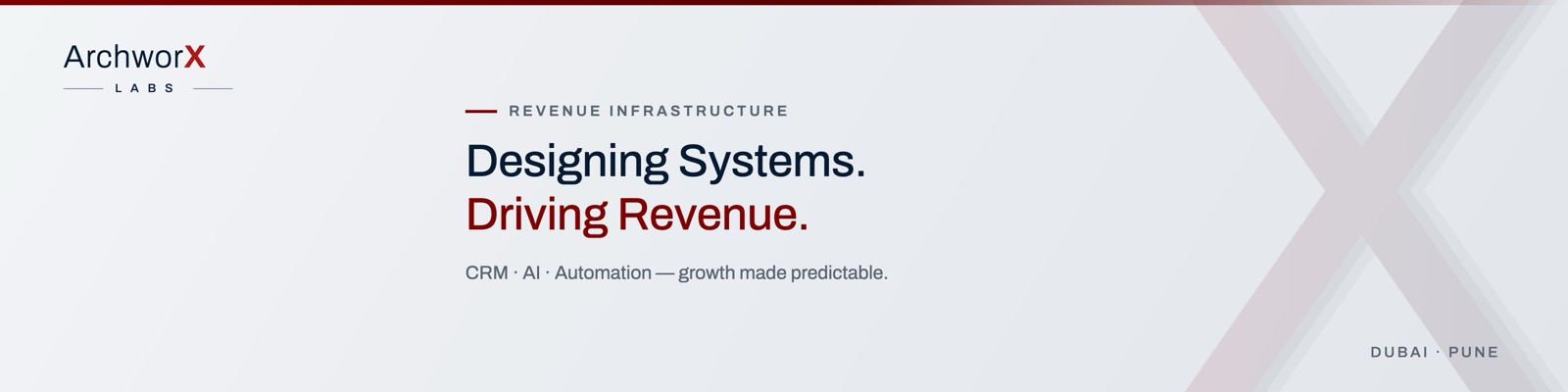
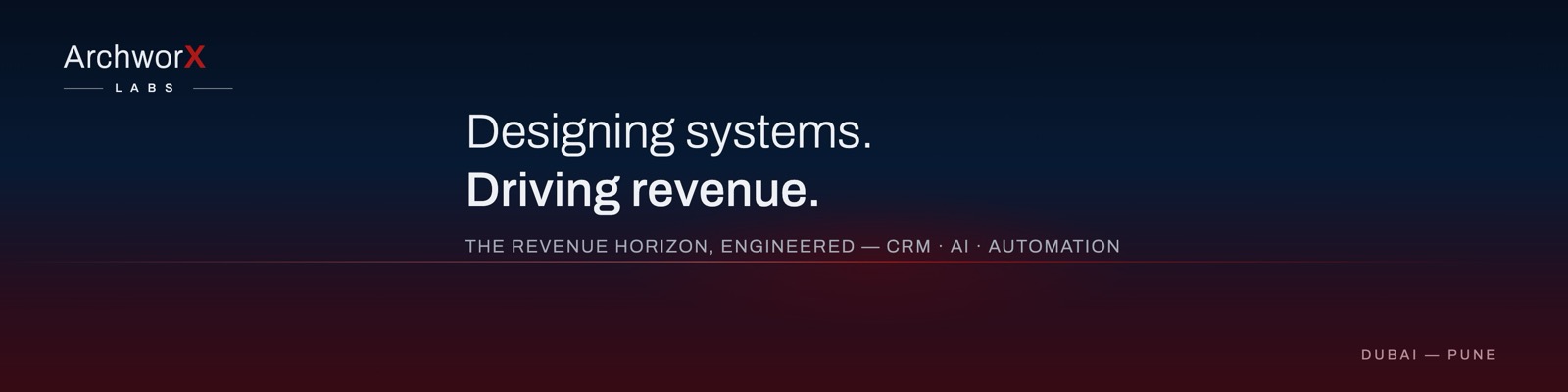
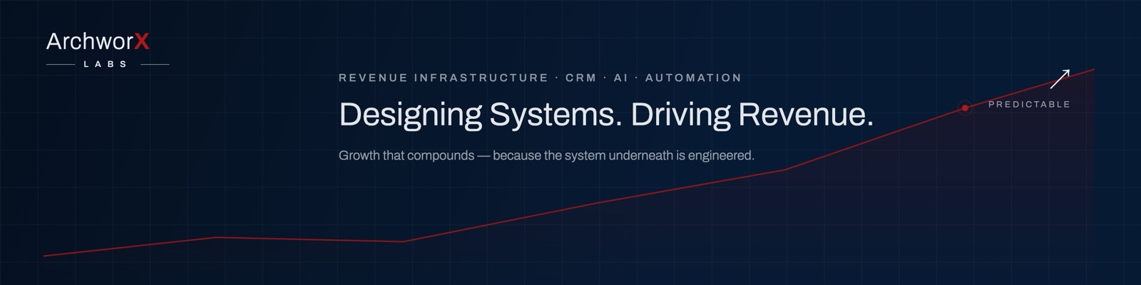
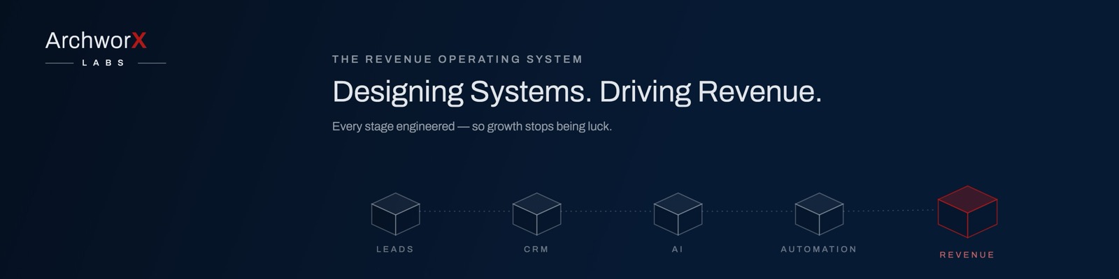
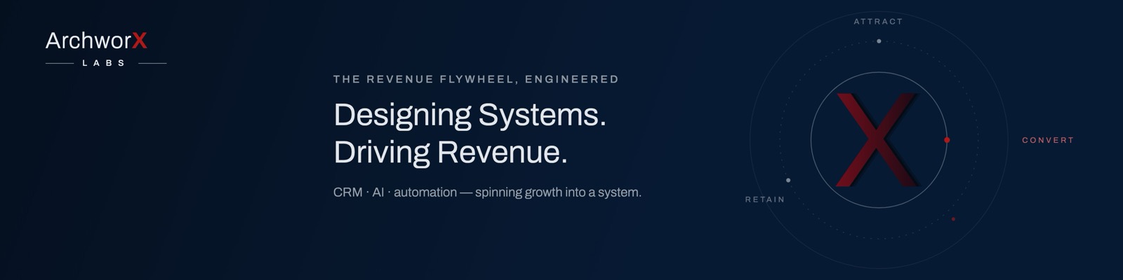
The identity then went straight into application: a LinkedIn brand kit with matching covers for the founder's personal profile ("Designing Systems. Driving Revenue.") and the company page — the brand working in the wild, not just on a board. The delivered covers were chosen from an 18-round design exploration — split panels, blueprints, revenue curves, and flywheels — a selection of which appears below.
Technologies & tools
- Logo Design
- Brand Identity
- Social Covers
- Vector / SVG
- Color Theory
- Typography
From the brief to what shipped
The challenge
Commissioned mid-way through the ArchworX Labs website build — the client liked how the engagement was running and extended it from the build to the identity itself. The brief: give a B2B revenue consultancy an identity as precise and premium as the systems it builds — confident and engineered, working from a favicon to a pitch deck, across Dubai and Pune.
Our solution
A structural oxblood "X" monogram and a geometric ArchworX Labs wordmark, delivered as a complete light-primary logo system (primary, reversed, monogram) on an oxblood / ink / stone palette with Archivo type and full brand guidelines.
What shipped
Distinctive structural "X" monogram — premium, engineered, ownable
Full logo system — primary, white-reversed, and monogram/favicon
Disciplined oxblood + ink + stone palette with Archivo type
Scales cleanly from favicon to large-format
Delivered with a multi-page brand guidelines document
LinkedIn brand kit — covers chosen from an 18-round design exploration
The engagement extended from build to identity — part of a standing long-term partnership
He understood our vision and translated it into a professional, modern, well-structured design that aligned perfectly with our brand — clear communication, real attention to detail, and high-quality work delivered on time.

The identity, working in the wild
A brand only counts when it ships — here it is applied to real collateral.





Want something similar for your business?
Let's discuss how we can bring your vision to life with the same level of quality and attention to detail.
Tip: use ←and→to move between projects